 All journal articles
Spatial observation · Bakery
Petite ÎleRediscovered traces, present-day uses
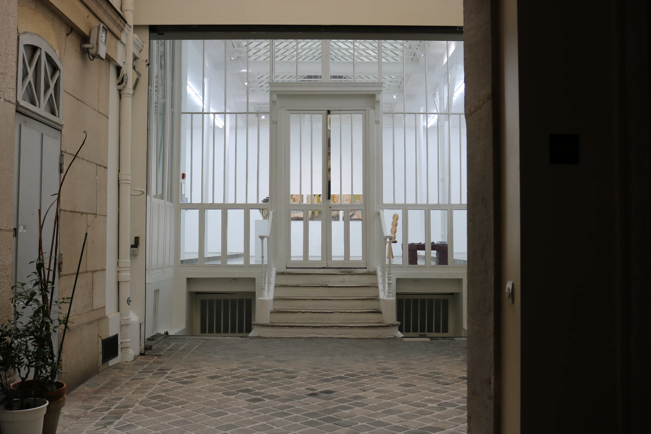
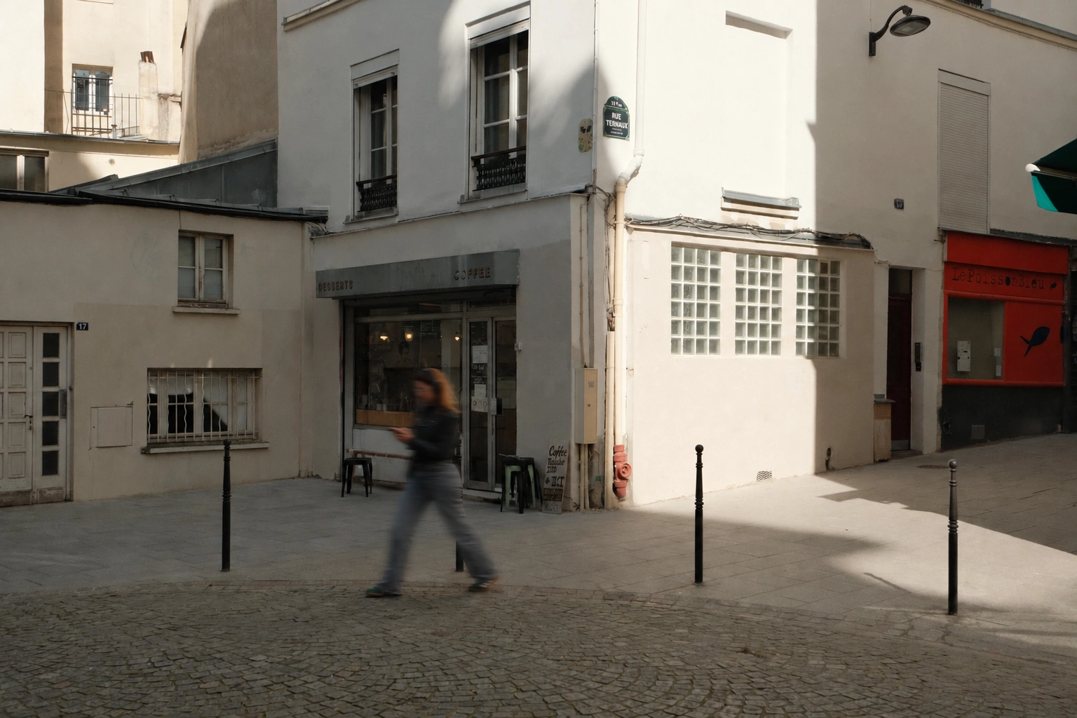
A façade that invites a closer look. From uncovered walls to the display seen from a seat, a reading of how an existing space meets the daily uses of a bakery.
Interior architecture: Valérie Mazerat.
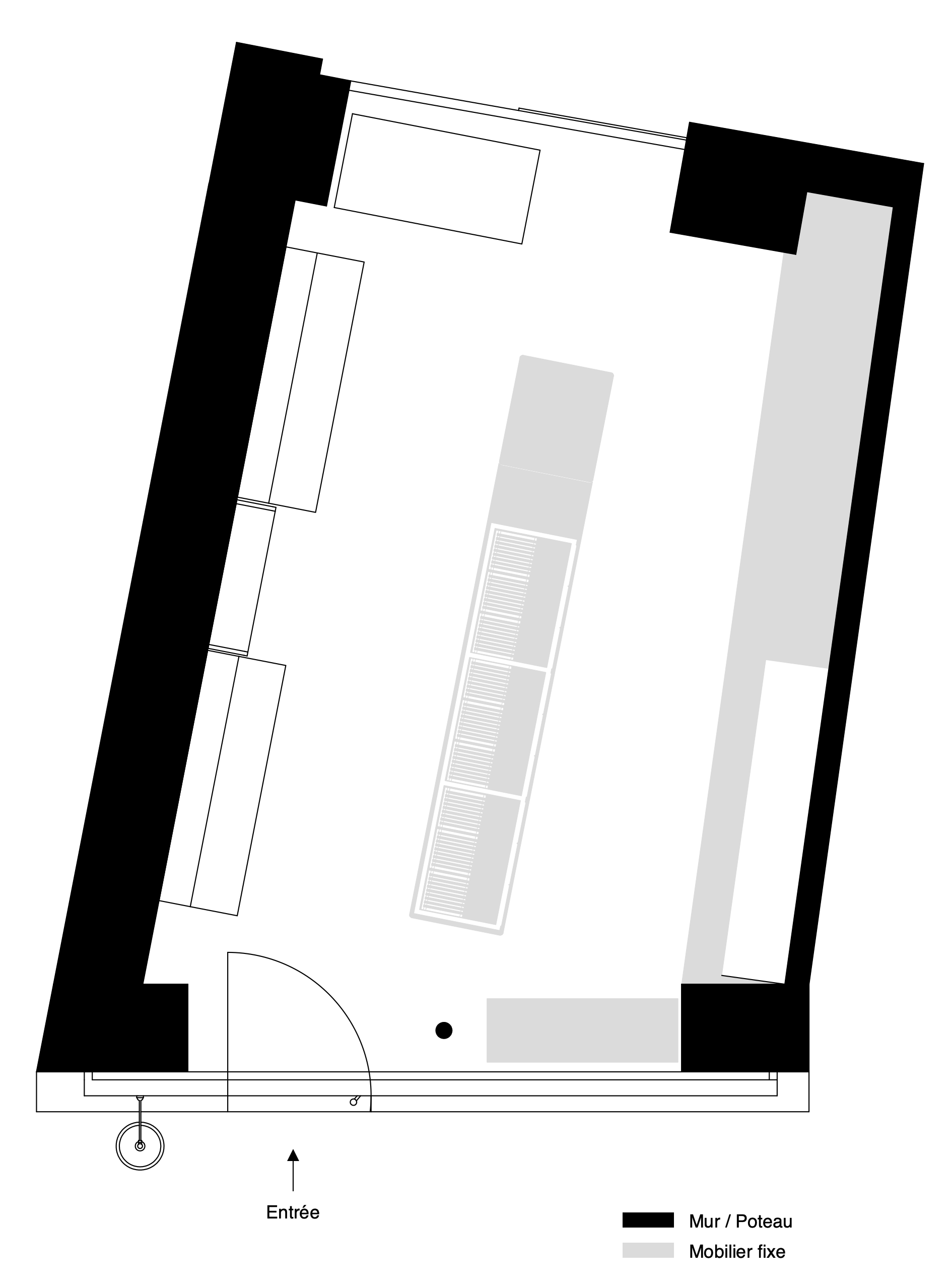
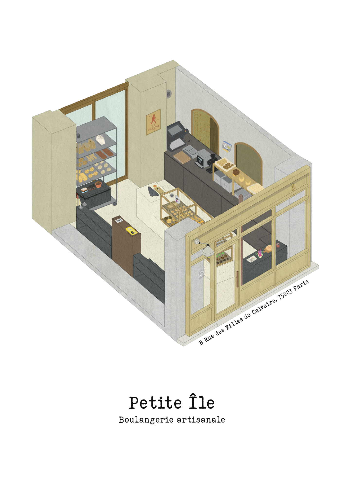
First, read the spatial relationships
The entrance, long display, counter and seating help locate the visit. During my stay, staff worked behind the counter while customers moved between it and the seats. This plan offers a starting point for reading those relationships.
A façade that makes you curious
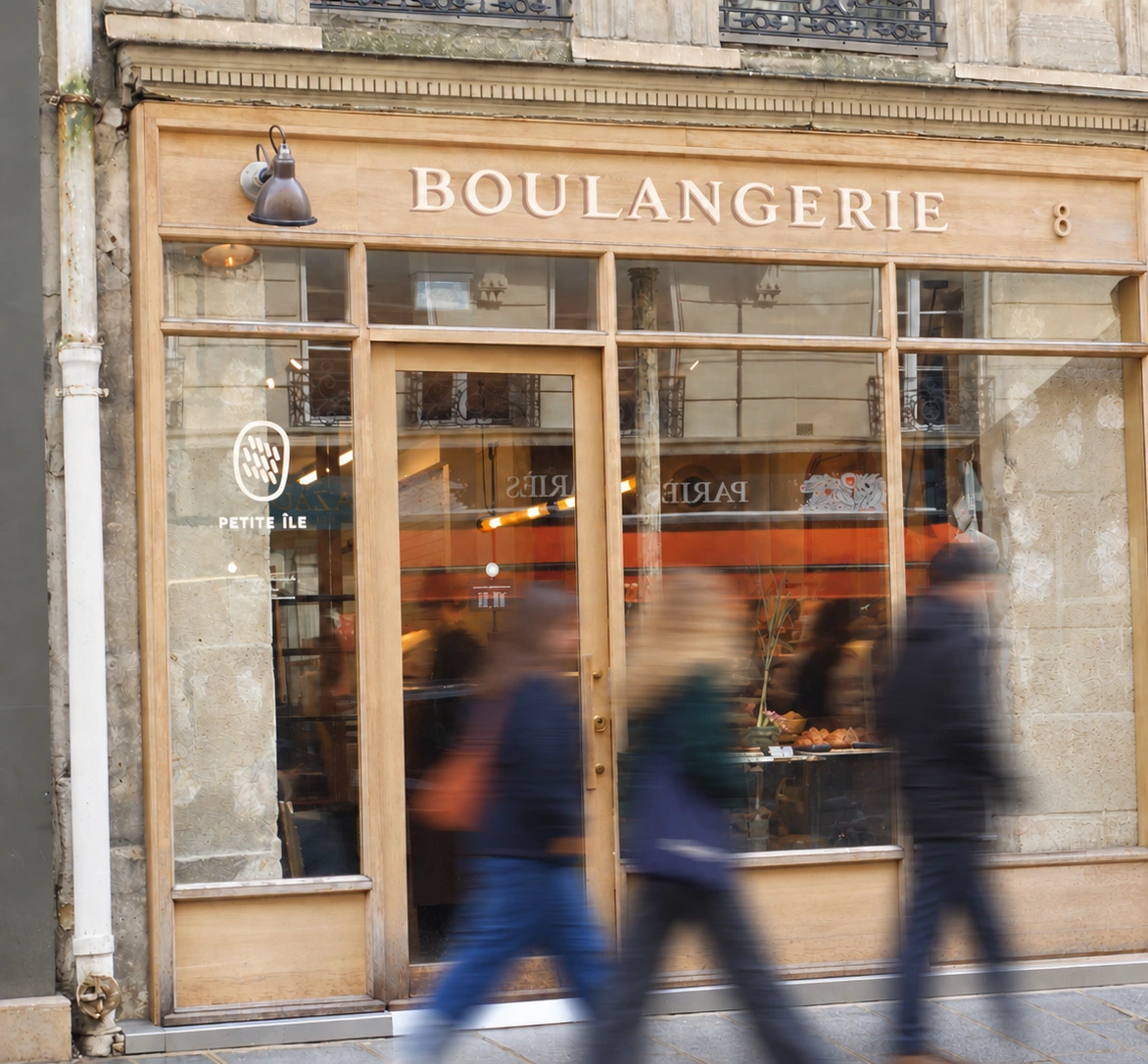
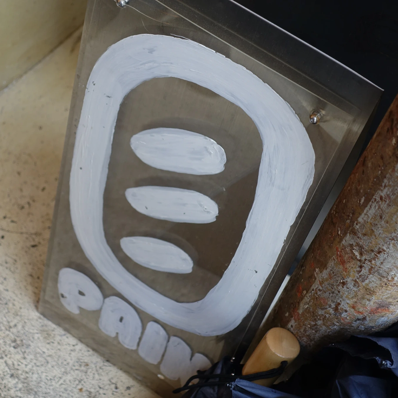
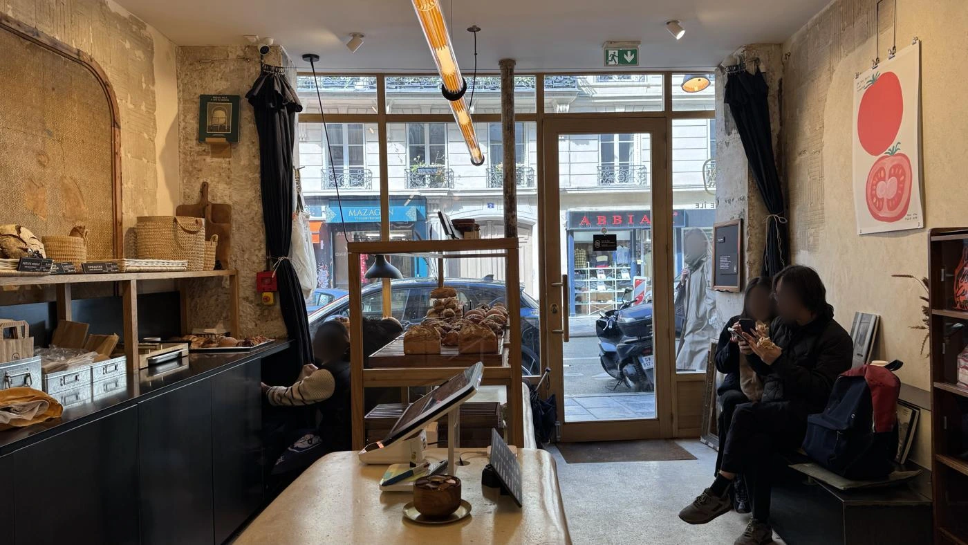
The façade was the first thing I noticed at Petite Île. Its colours and logo came together with a playful charm. The space glimpsed through the shop window made me curious: I wanted to move closer and look inside.
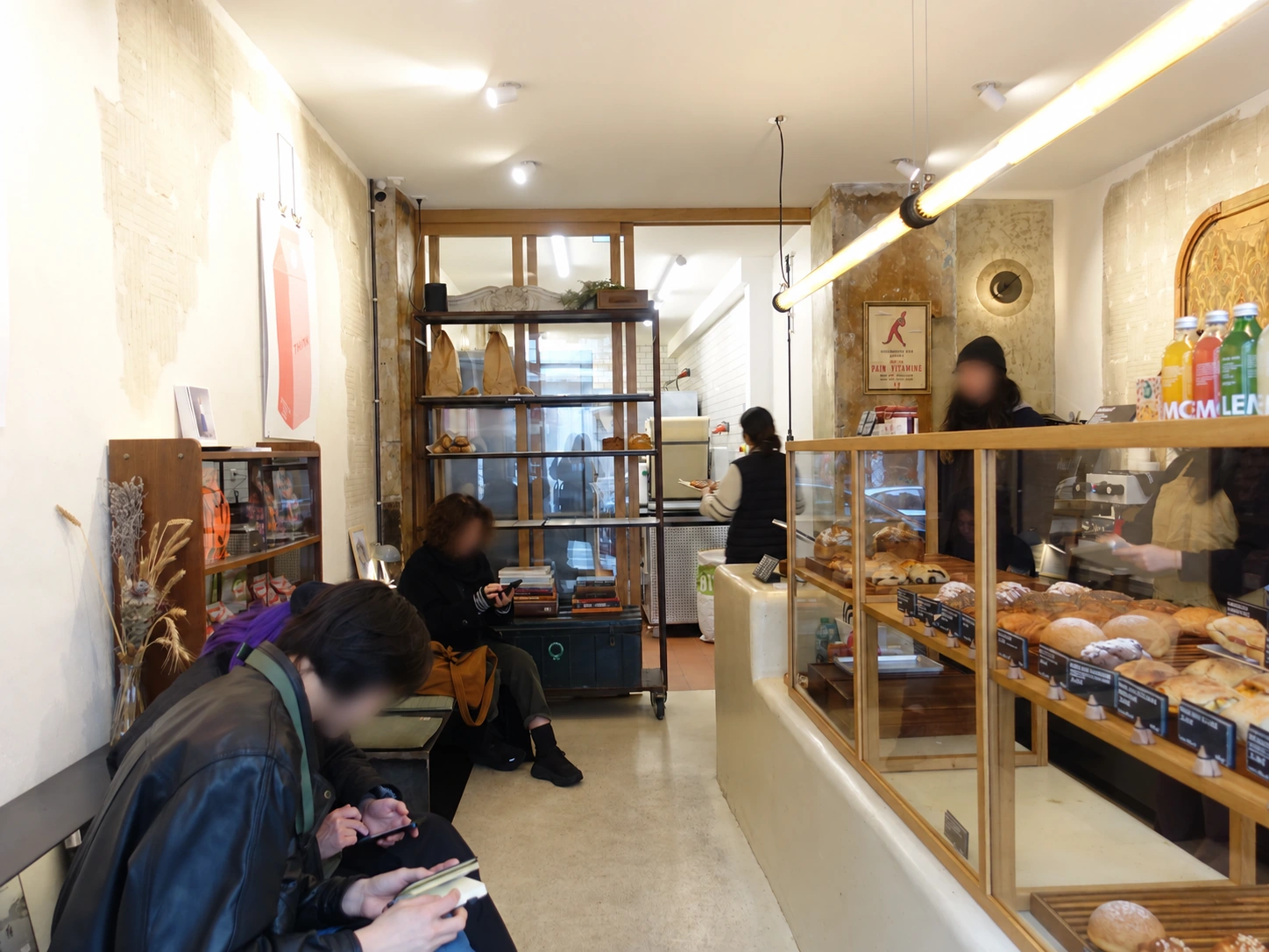
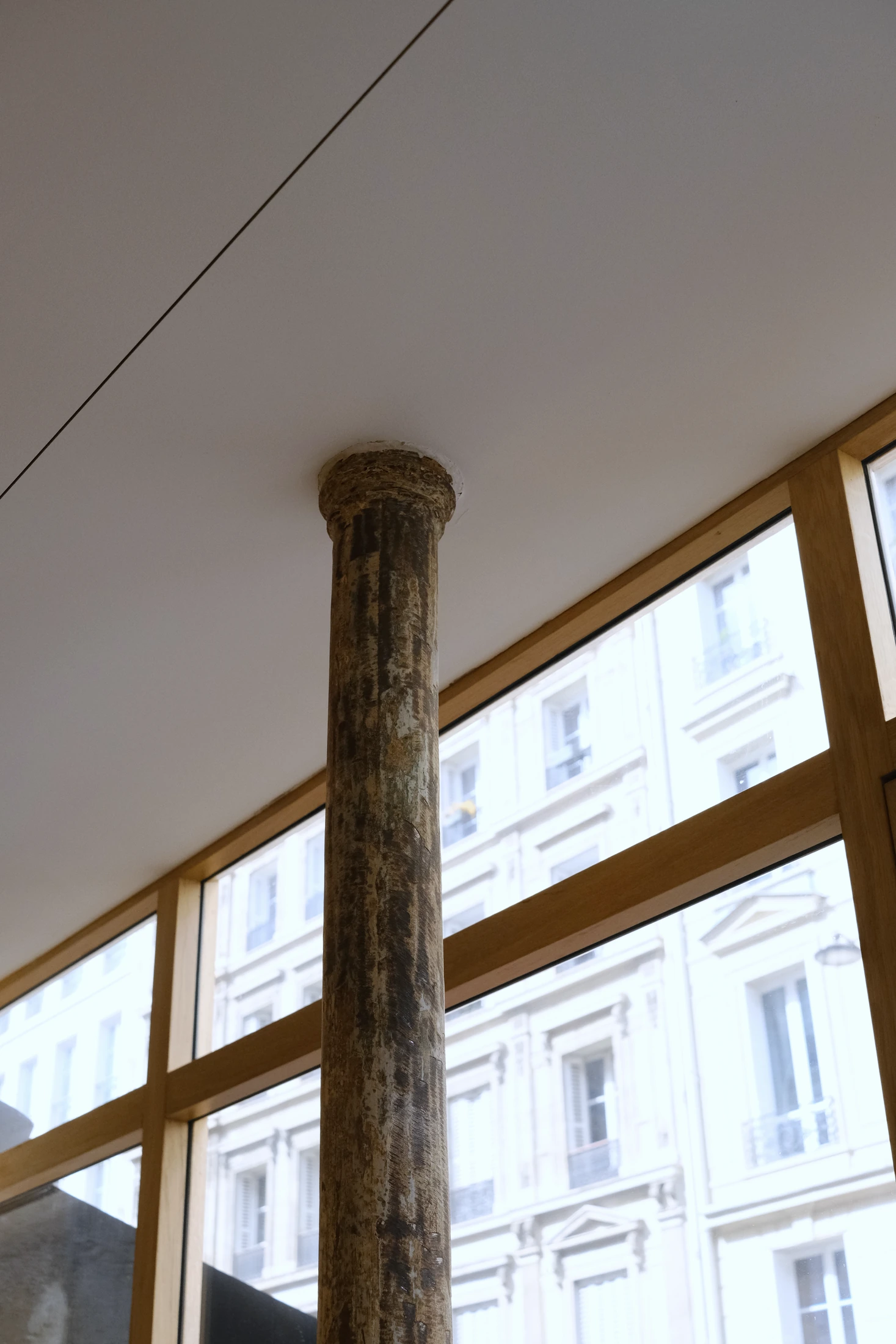
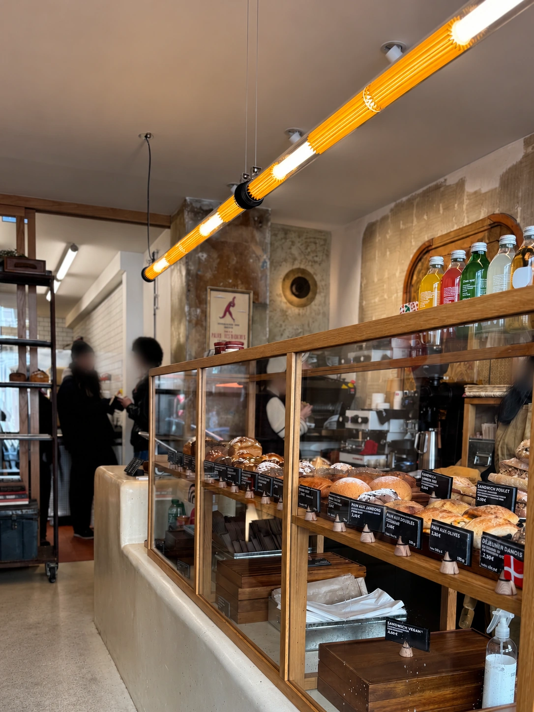
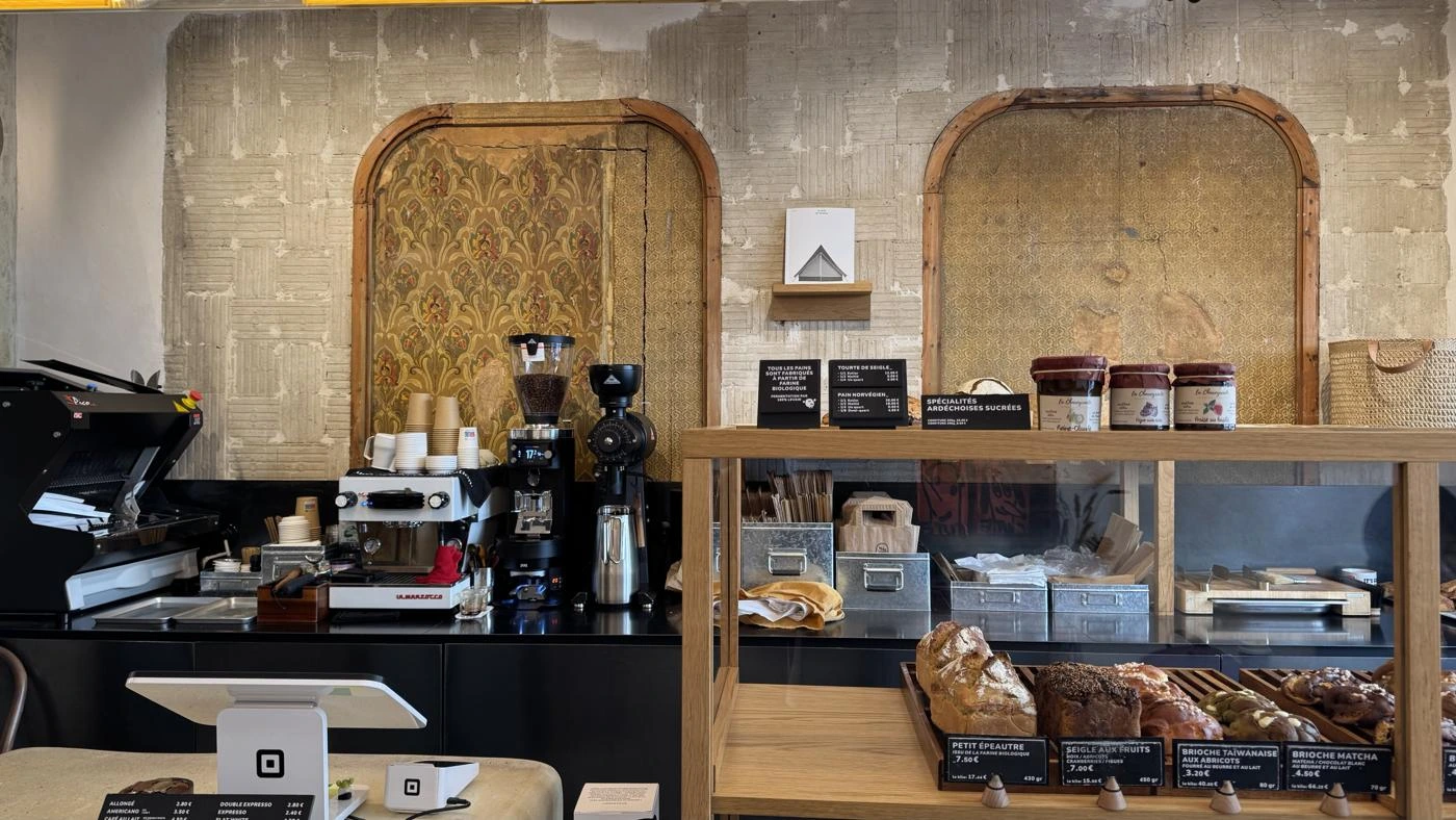
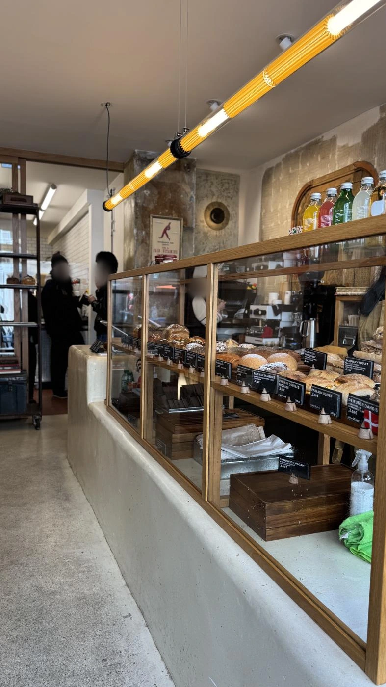
A long display appeared beyond the glass. Once inside, I noticed the texture of the walls, the columns and the structure of the shop window. I was struck by the way the interior made use of the existing building’s character.
A space uncovered layer by layer
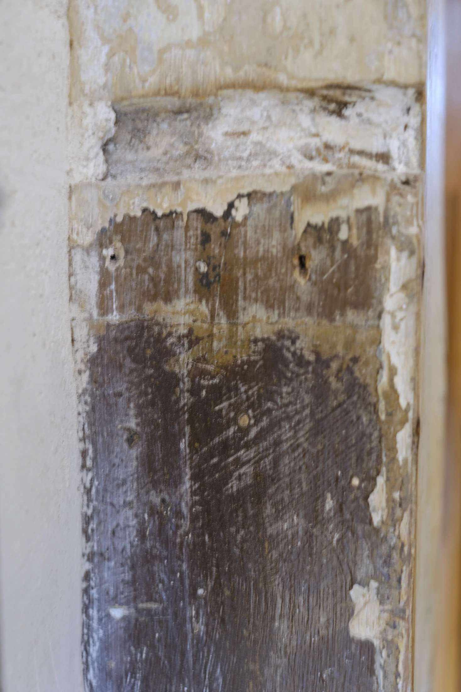
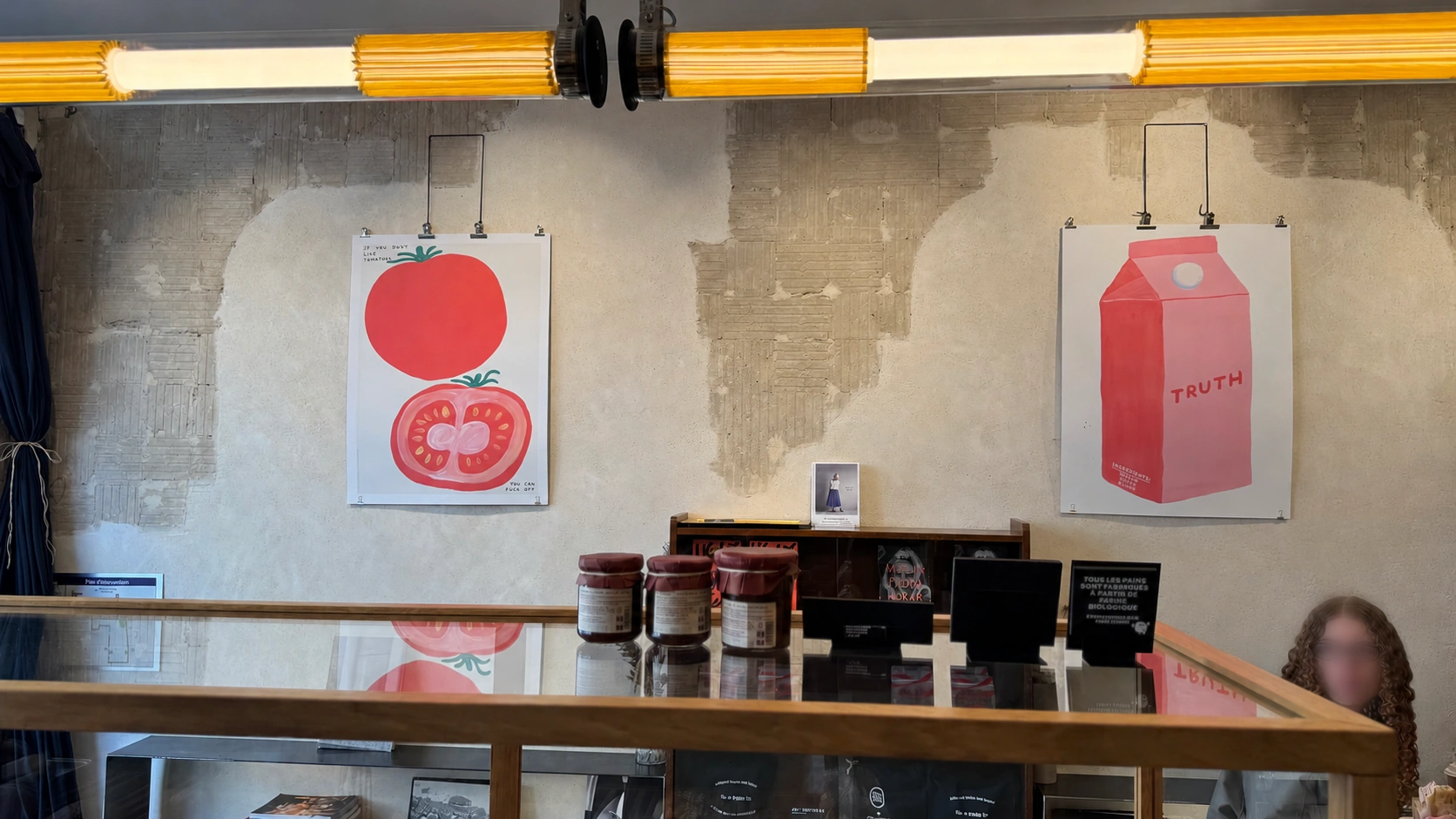
The owner’s account added depth to that impression. He told me that the walls and mouldings behind the counter had not originally been visible. They emerged as the layers covering them were removed.
It felt as though the owner and designer had uncovered a layer of the place together. Those traces seemed neither excessive nor unfinished. Keeping them read as an intentional choice, giving the bakery an identity of its own.
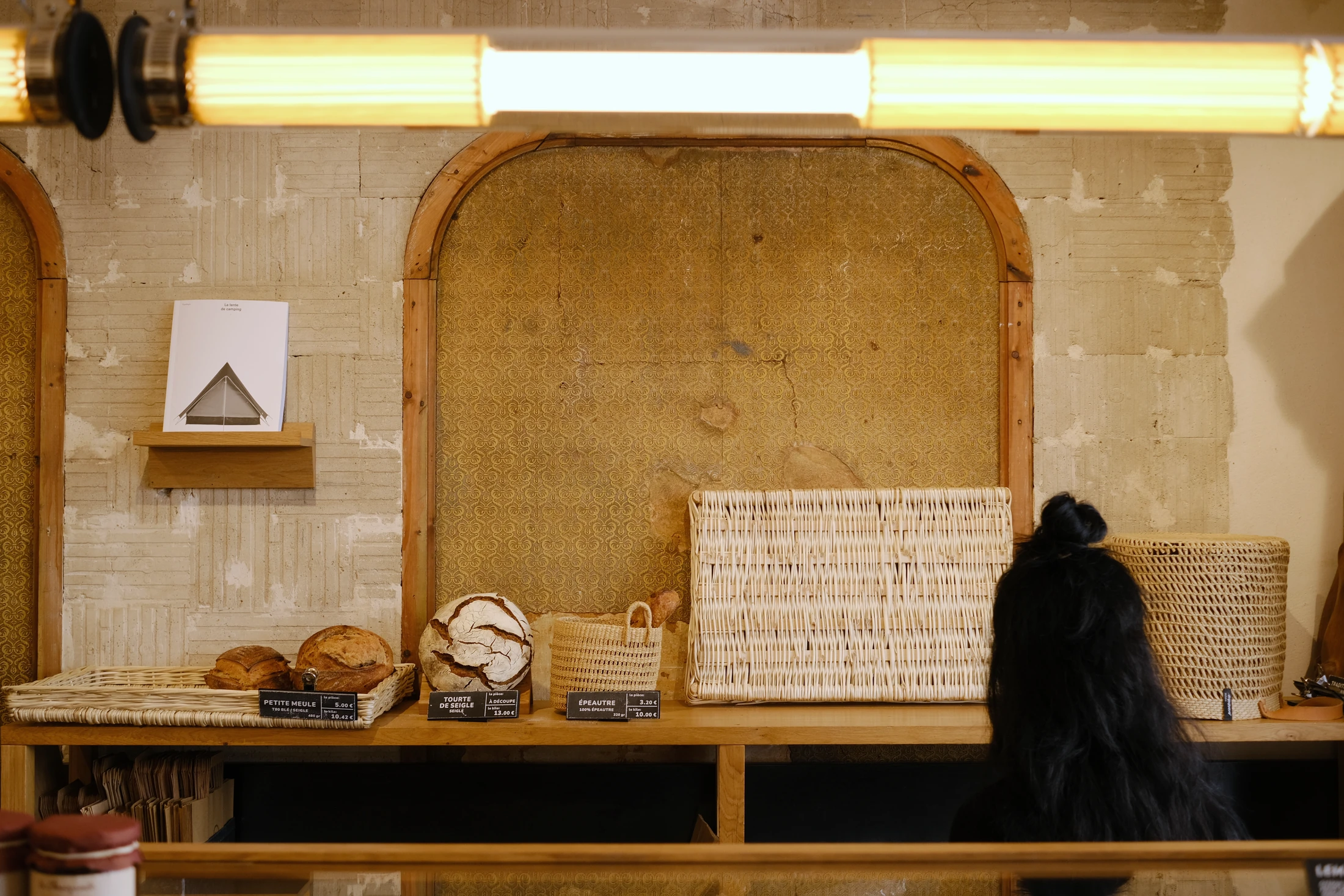
New elements finding their place
The new parts of the interior were clearly recognisable. Even so, the space as a whole felt as though it had always been this way. The wall textures, mouldings, columns and shop-window structure still had a role in the present interior.
I first noticed the harmony of the whole, then the lights, display and smaller details began to emerge. Elements made at different times seemed to find their place naturally within the same space.
A line of light above the display
Long tubular lights hung horizontally above the display counter. These are the In The Tube 360° horizontal pendants by DCWéditions, designed by Dominique Perrault and Gaëlle Lauriot-Prévost. Borosilicate glass, aluminium and stainless steel form a structure with its tubes and connections left visible.
Here, the slender line runs alongside the timber display. Its clear geometry stands out against the uneven wall surfaces and old mouldings. Gold-toned sections inside the tubes alternate with exposed light, giving the long arrangement a rhythm. The eye moves from the bread and display to the traces preserved on the wall behind them.
Product information : DCWéditions — In The Tube 360° ↗
Kept samples, an ongoing conversation
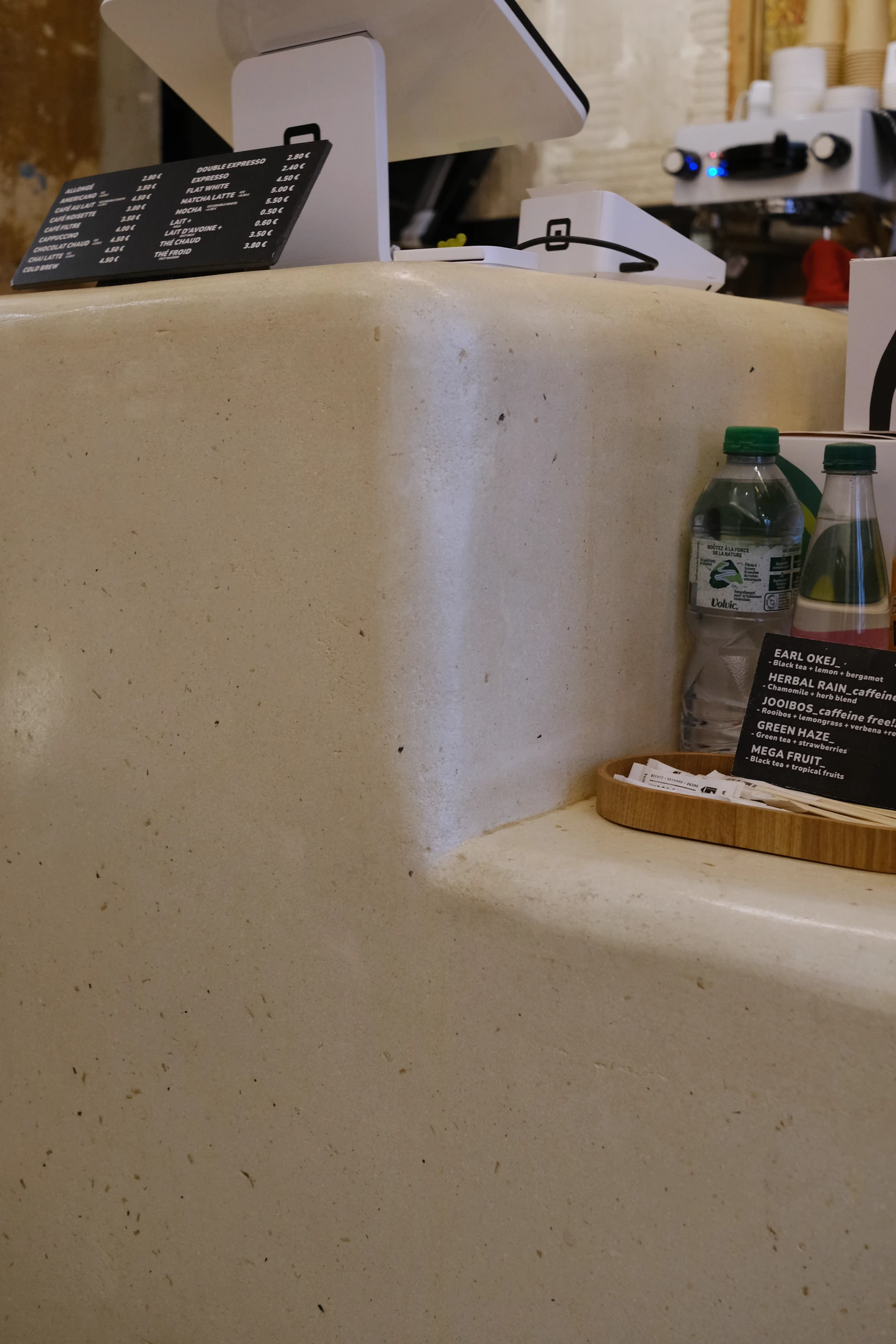
The owners had kept the material samples received during the fit-out. During my visit, they brought them out to explain the choices for the floor and counter. What stayed with me, more than the material names, was their care in keeping and sharing that process. Seeing the people who use a space engage with its materials from the design stage and willingly share their choices reminded me how this mutual curiosity can deepen our understanding of architecture and interior design.
In a finished space, colours and textures catch the eye first. Samples also make room for the comparisons and decisions behind those surfaces. This conversation connected with my interest in how materials relate to use.
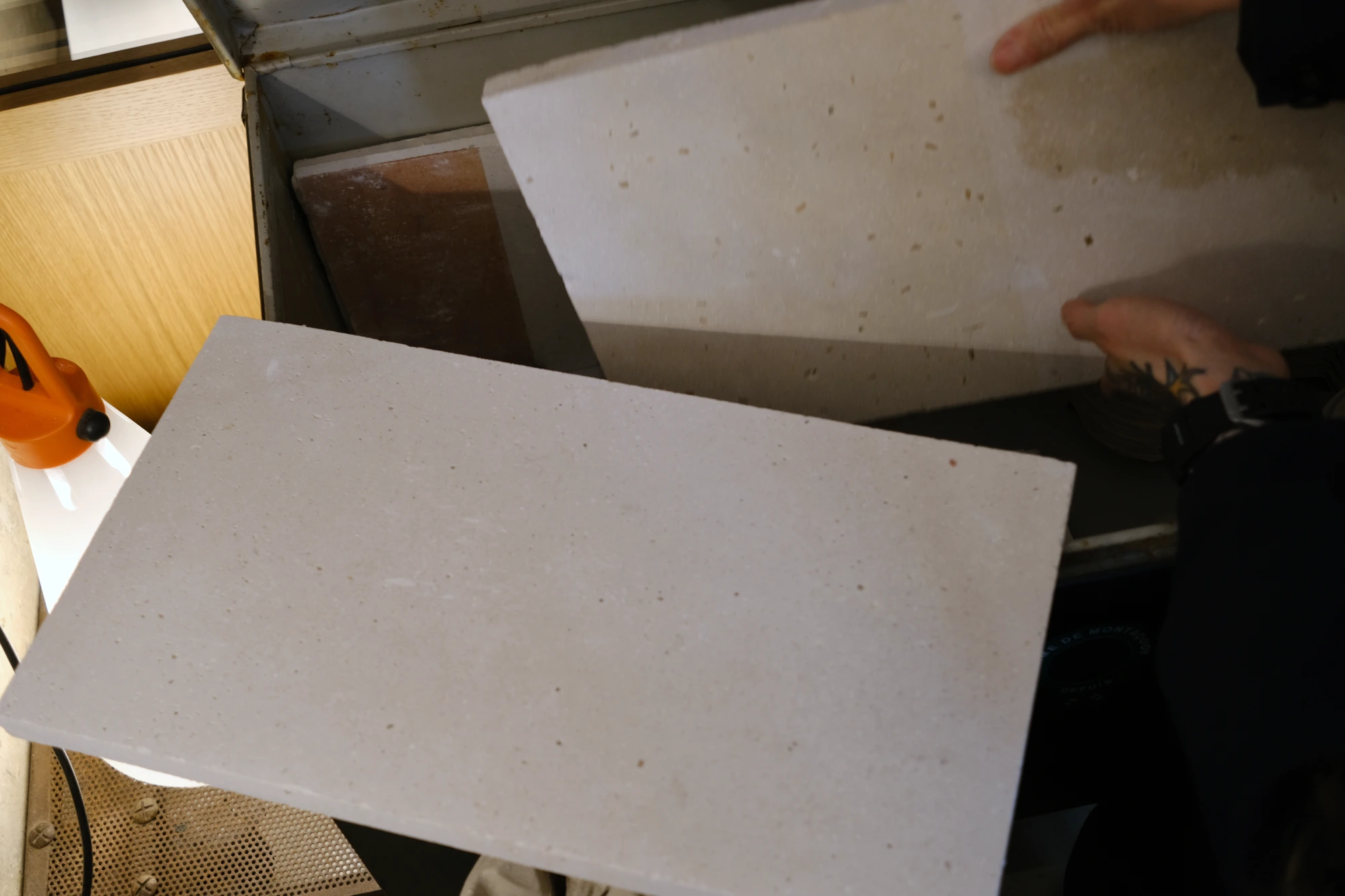
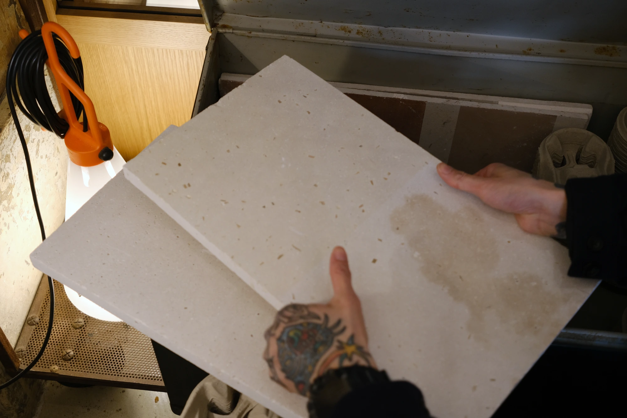
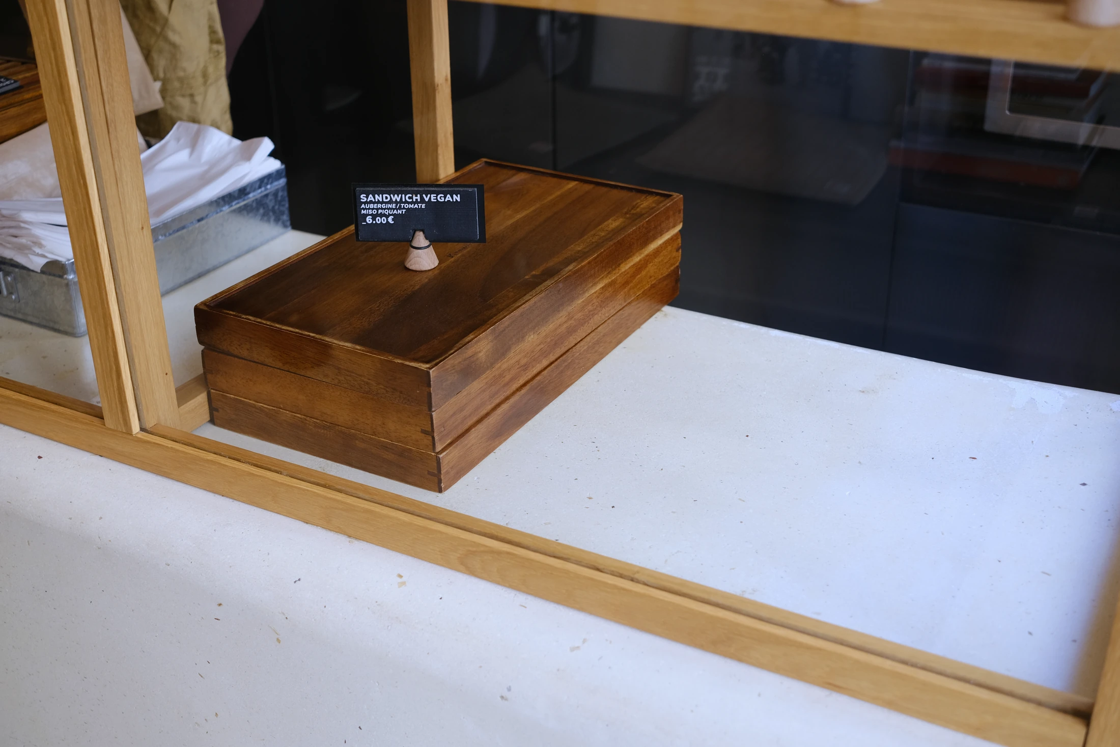
A 2023 Vogue Taiwan article describes wood and a curved plaster display counter. The exact floor composition and finishing products remain unconfirmed here. Vogue Taiwan, 28.07.2023 ↗
The display remains in view
I sat along the wall facing the counter. From there, the display and counter were directly in view. The clean glass made the bread easy to see; even after sitting down, I wanted to choose more.
The display continued to work beyond the moment of choosing bread. What was visible from the seat extended the experience. Staff moved behind the counter, while customers used the passage between it and the seating. During my visit, their respective areas felt clearly defined and staff movement appeared comfortable.
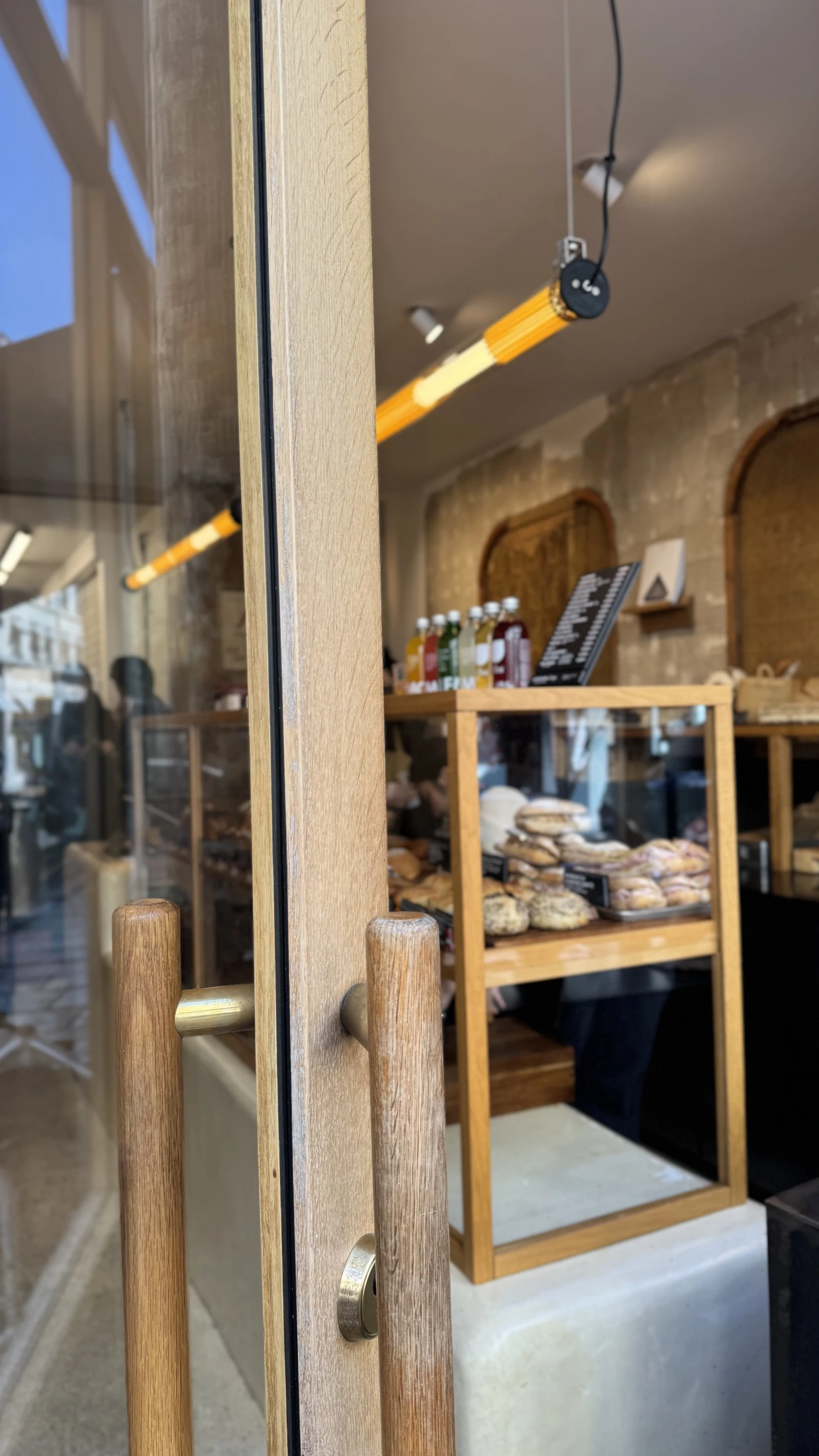
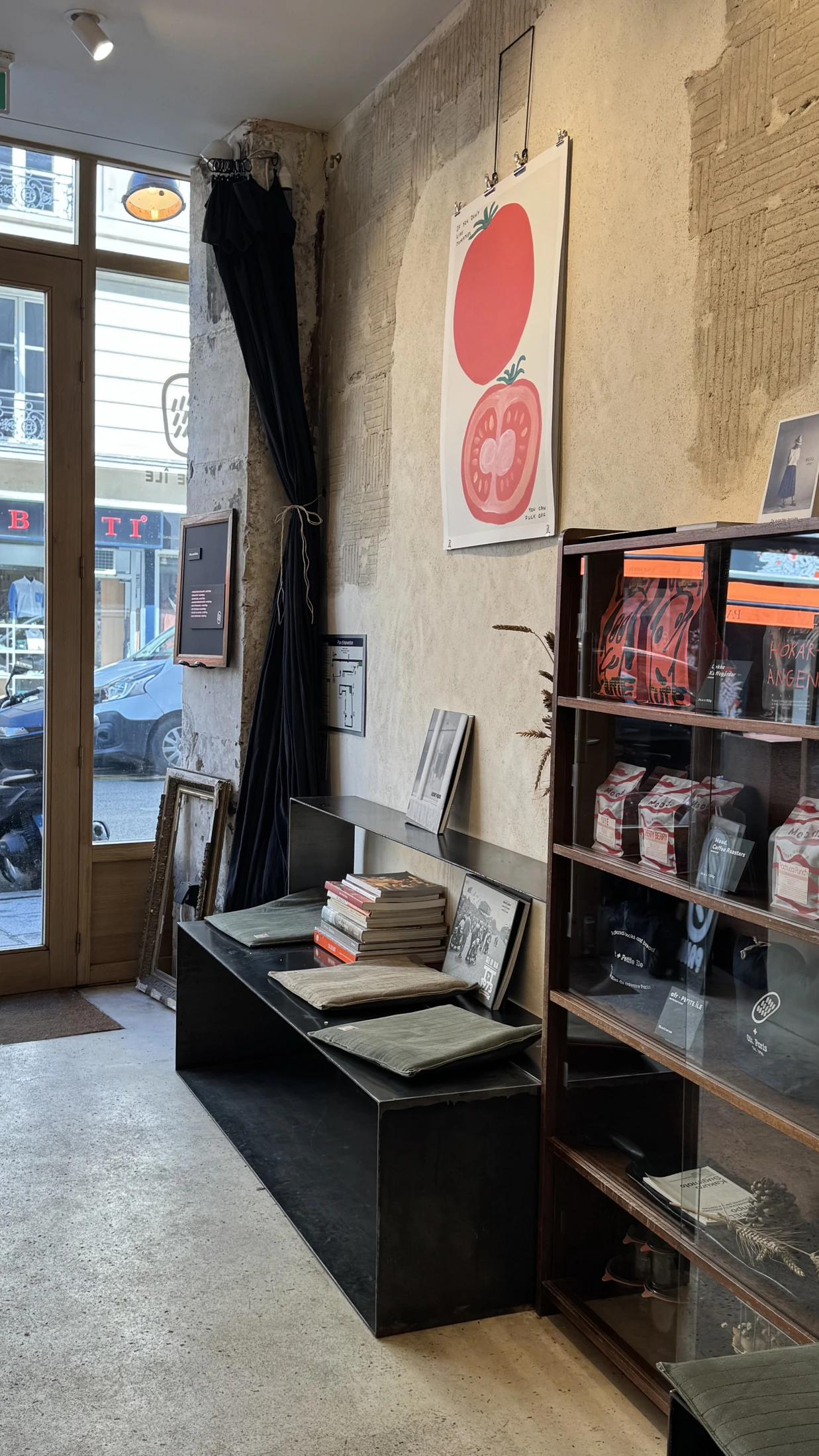
Details discovered while staying
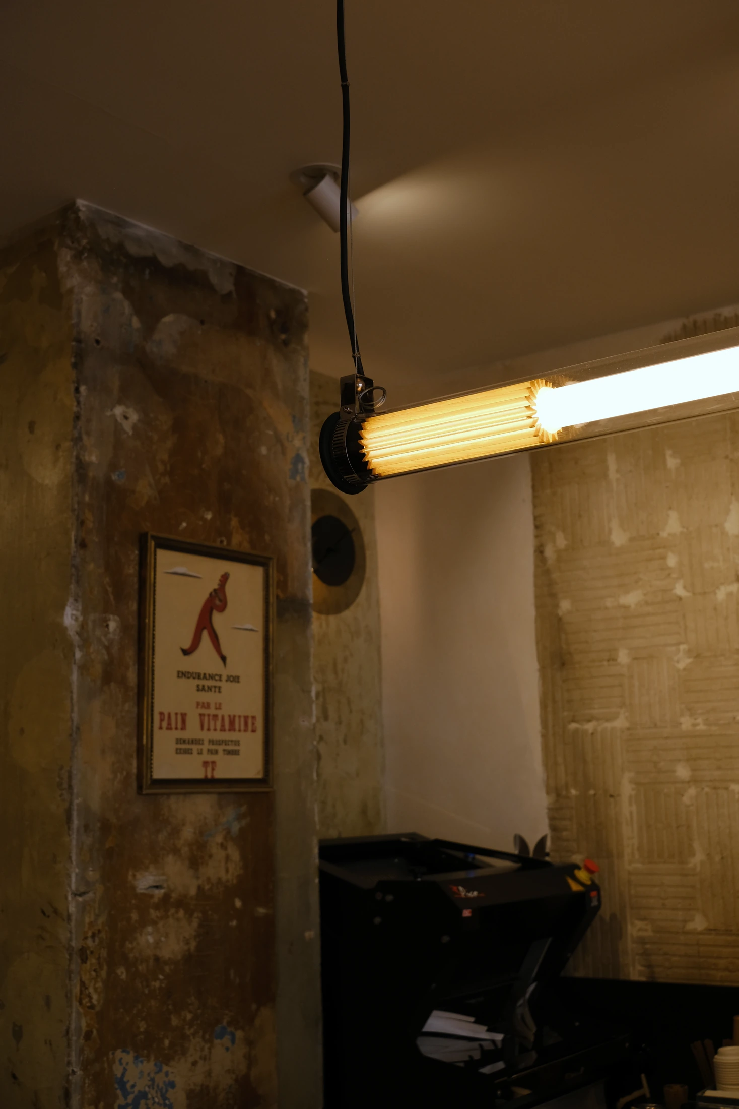
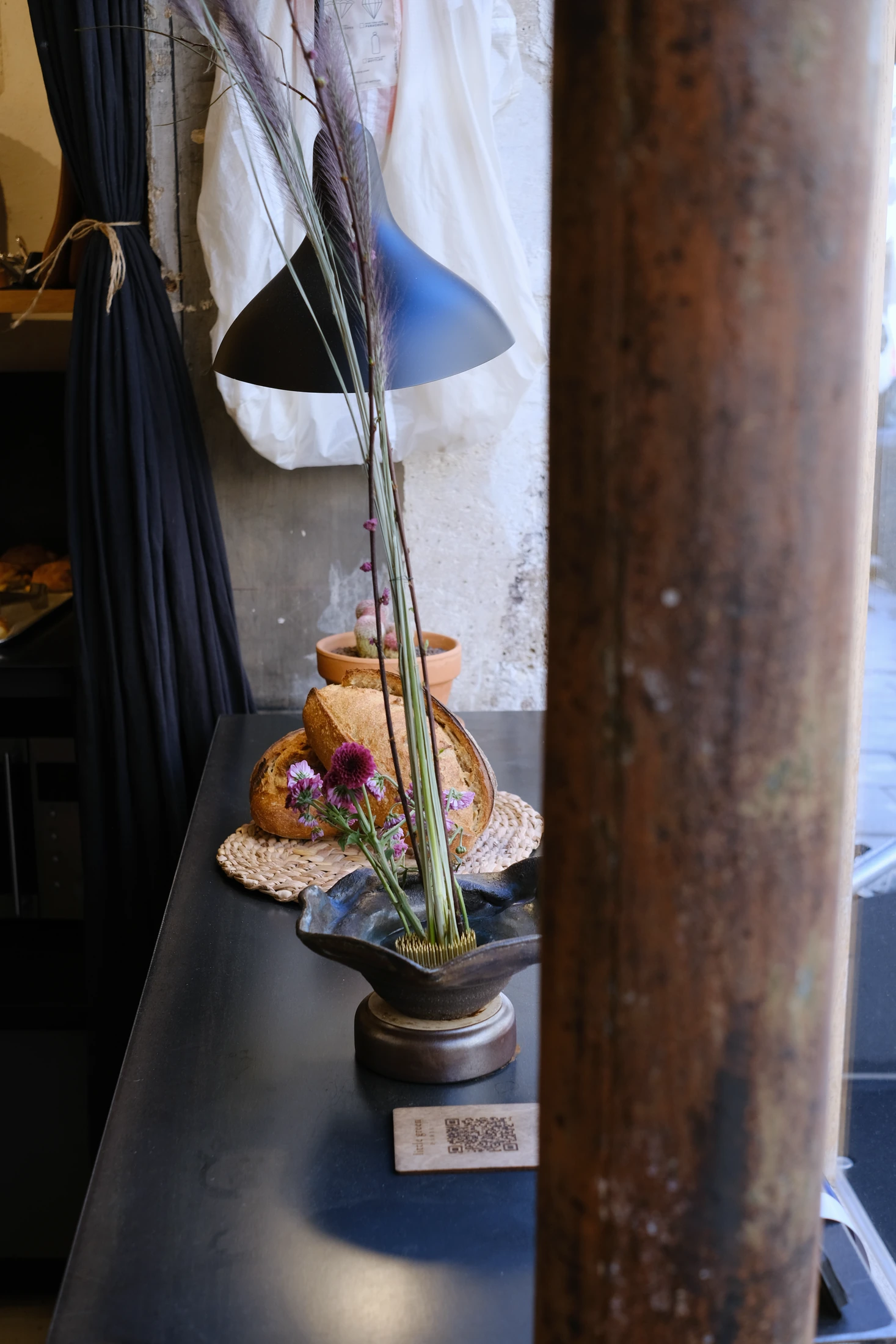
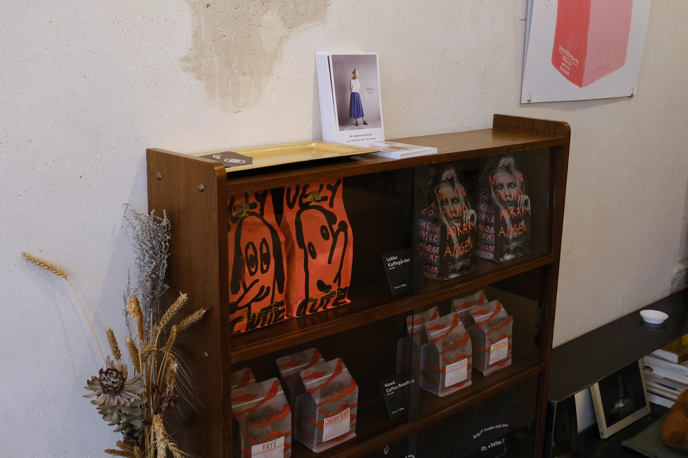
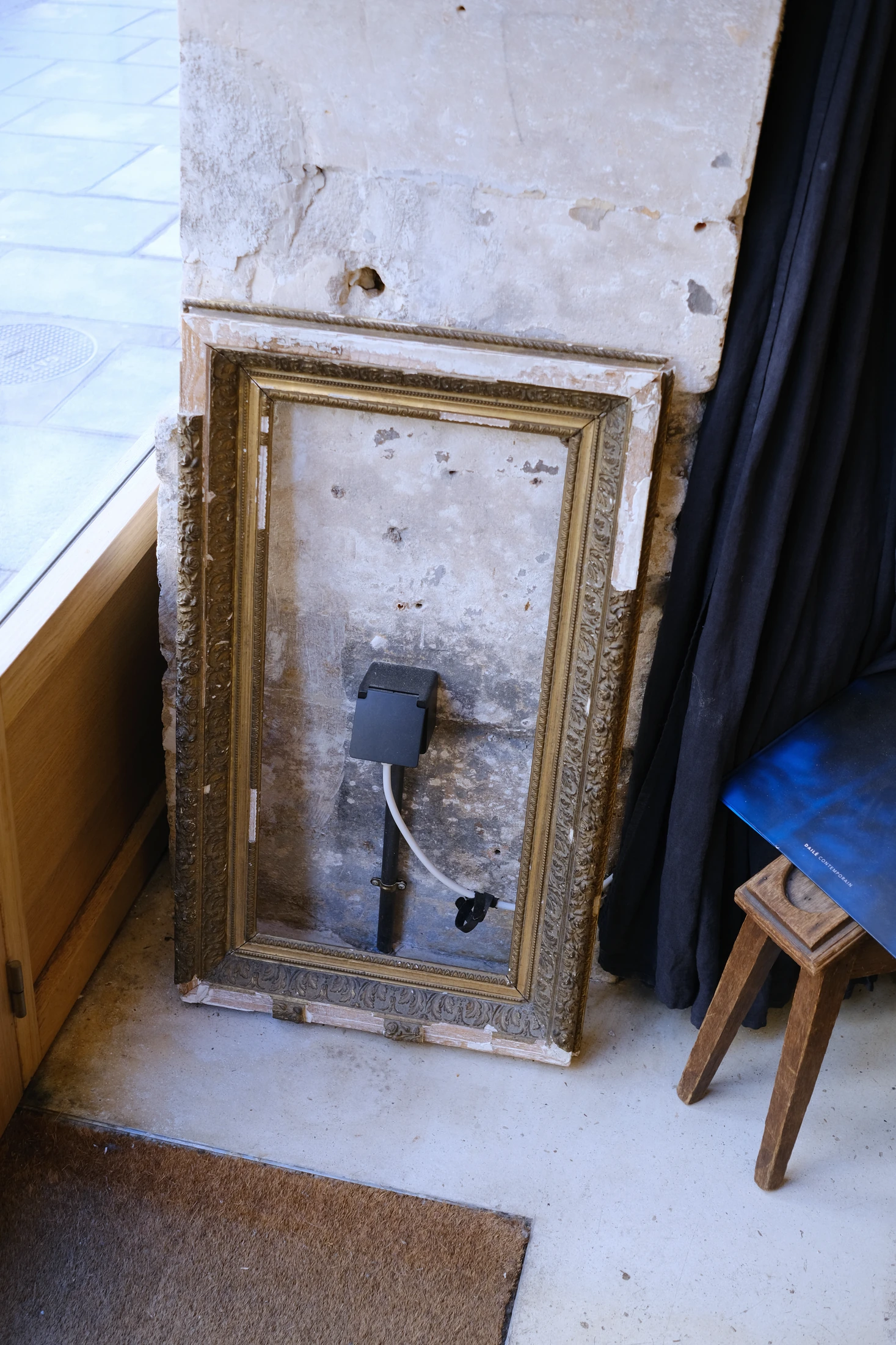
Scroll to explore the other details.
Details in motion
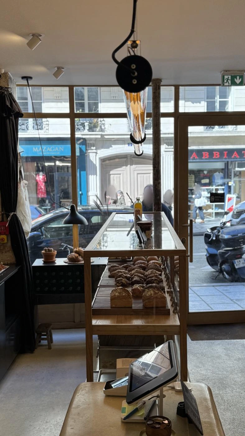
What is worth keeping?
When deciding what to retain in an existing space, I begin with its intended purpose and use. Beauty belongs within that consideration too: holding attention or giving a place its character can itself be a function.
I also consider the conditions of keeping something: safety, suitability for its use, movement through the space, and whether the result justifies the time and cost of the work. In a commercial interior, these decisions are closely connected to daily operation.
What interested me at Petite Île was the place these rediscovered traces had found in the bakery’s present life. In front of them, people choose bread, work and sit. The existing building and its new uses come together with a familiarity that makes the recent interior feel already settled.
Photographie retouchée.
Words · spatial observations: Jinhee Kim / PAADO ARCHITECTURE
Co-éditeur : Chaewoon Ha
ha.chaewoon@gmail.com
Video: Jinhee Kim